AT&T ― Access Customer Journey
BBDO ✺ Concept | Visual
After AT&T completed its acquisition of Time Warner, they wanted to change their brand identity to communicate that AT&T customers now in media-heaven and have unparalleled access to a massive content library and exciting experiences.
To facilitate this transformation, my proposal centers around crafting a thorough customer journey, prioritizing the delivery of a unique, "money-can't-buy" experience. This includes engaging customers through both digital and physical channels while conveying a dual message of exclusivity and inclusivity.
The Task
✺ User Research
✺ Brand Strategy
✺ Concept
✺ Art Direction / Visual Design
✺ Brand Motion Study
Research


Key Takeaways
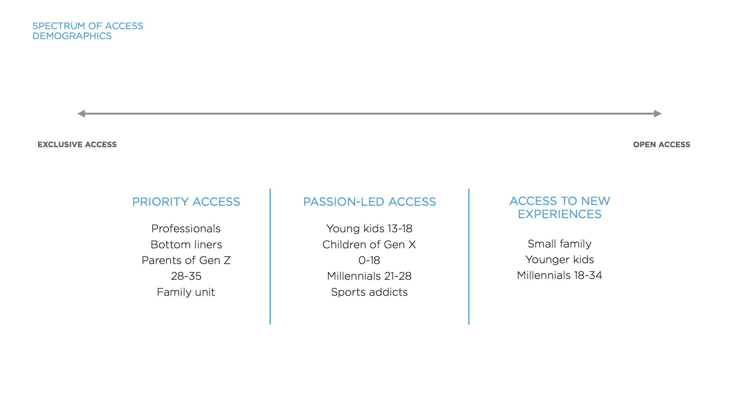
By creating a spectrum of “Access” ranging from exclusivity to inclusivity, we created three customer groups:
Priority Access - catering to professionals, bottom-liners, parents of Gen Z (ages 28-35), and family units.
Passion-led Access - targeting young kids (13-18), children of Gen X (ages 0-18), millennials (21-28), and sports enthusiasts.
Access to New Experiences - tailored for small families, younger kids, and millennials (18-34).

Ideation + Motion Test
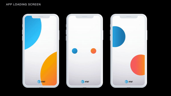
Based on the cumulative research, I decided to create a persona that is recognizable, dynamic & highly flexible.
With a dynamic identity rooted in diversity of expression and the rich symbolism behind a simple circle, the notion of access can live within AT&T’s mission. With the circle, I wanted to introduce diversified experiences through color, as well as symbolism behind infinite opportunity with the integration of multiple circles throughout the design ecosystem.


Solution
Here are the touchpoint that can build one full customer journey throughout access:
Having consistency of the shape that ties into AT&T’s logo, with various executions across touchpoint. I was able to create persona that we feel encompasses access in terms of design exploration.